Button

Guide users to important tools and resources with a customizable call-to-action that fits your brand.

ButtonWebPart Studio for SharePoint
Button WebPart Screenshot

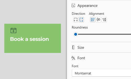
Highlight important actions, links, or navigation with a fully customizable button. Direct users to key resources, forms, or tools using a visually prominent call-to-action that can be styled to match your brand.

Features

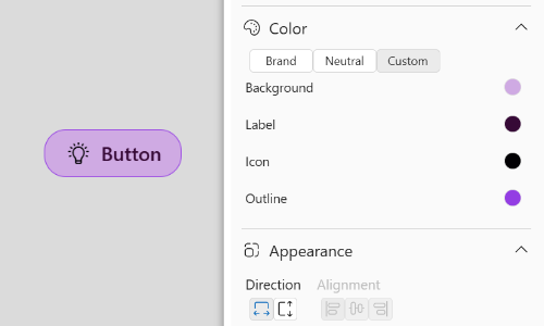
  • Custom colors to match your brand
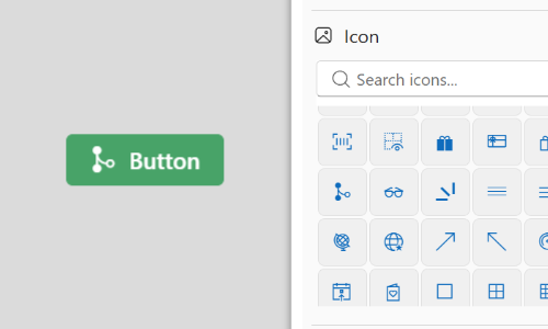
  • Optional icons for added visual clarity
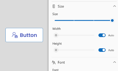
  • Multiple size options for different layouts
  • Vertical or horizontal alignment for flexible design

Brand-aligned styling

Customize colors, borders, and appearance so buttons fit seamlessly with your organization's brand.

Try now
Button WebPart Screenshot

Icons

Add an icon to reinforce meaning and improve recognition at a glance. Choose from hundreds of available icons.

Try now

Flexible sizing

Choose from multiple button sizes to suit different layouts and levels of emphasis.

Try now
Button WebPart Screenshot

Adaptive layouts

Display buttons horizontally or vertically to fit naturally within your page design.

Try now

Try it out

Try the Button WebPart right here, just like you would in a SharePoint page.

FAQ

Install now

Support

Need help with your web parts? We're here to support you every step of the way.

Button WebPart Privacy Policy

You may also be interested in

WebPart Studio for SharePoint Features
Button List
Guide users to important tools and resources with customizable call-to-action buttons that fit your brand.
WebPart Studio for SharePoint Features
Card Grid
Organize multiple pieces of content in a responsive grid of cards that can be styled to fit your brand.
WebPart Studio for SharePoint Features
Bulleted List
Turn blocks of text into clear, easy-to-scan bullet points that can be styled to match your brand.